
Final Fantasy XV - General News Thread
- Thread starter LeonBlade
- Start date
Members see less ads - sign up now for free and join the community!
Some things i admittedly don't like are L1/L2 weapon switch for four weapons (it makes getting to the weapon i instantly want on a slot more tedious), L1-R3 for lock on, lack of shortcuts for combat related things like techniques & etc, and direct summon control (due to the latter's case encouraging potential AoE spamming unless summons are completely overhauled which would ironically go against the OP's intent on not changing too much). Mini-map also looks really bad
Overall i like the idea but making it less scroll-happy in certain aspects would be better.
Overall i like the idea but making it less scroll-happy in certain aspects would be better.
Last edited:
Likes:
stolas
Too big?
First of all the command guides are split up and are located on both sides of the screen. When you have a new player playing the game for the first time, this makes it more difficult to adjust as you'd have to look left and right just to get used to the controls. Granted that this is not a problem for experienced players, but at that point, most would turn command guides off completely. So as a beginner guide, it's completely off the point. Personally, the existing guides are perfectly fine on the middle right side of the screen.
Next, moving tech and the armiger bars to the right side is also not a good choice. It's just making more eyework. Action games need to focus the eyes on the center of the screen where the action is happening as much as possible, otherwise it becomes a situation like FFXIV where is 95% looking at UI and 4% looking at numbers and 1% actually looking at the boss.
HP gauging isn't as important and you don't really look at it that often, unless it's a game that requires HP management. Which is why visual indicators are present when in critical HP.
Also, from what I understand, you switch through weapons, magic and items etc using the left and right buttons. This is actually pretty bad design in today's standard. Like you would need to scroll through multiple weapons to get to one and what if you go trigger happy and press too many times? Things like weapon switching need to be snappy and instant, which FFXV does good at as it is.
There are a lot of things. But gotta get back to work.
Likes:
T.O.T, LeonBlade and Nova
I have two issues with that HUD:
Issue 1
Or in other words, obstruction of information. Now you could make the argument that I just have to memorise what object was in what order but, the heat battle can be distracting and it's unnecesary effort that OG wheel never demanded because you could see all four item icons on wheel with just a single glance and know exactly what you had.
Issue 2
This makes getting to the weapon I want a step more tedious . Say I'm on slot 1 and I want to equip the weapon that's in slot 3, no matter if I use left or right, getting to that weapon now requieres two imputs when in OG wheel it only requiered one. The idea could have flowed better if the game only allowed three weapons slots but unfortunately it allows four. This same issue would apply to the magic tab (and I say it would be worse since with your HUD, now you would have to do one imput to go to the magic and a potential second imput if the spell you want to use is not in that slot). This leads to another problem that weapon/spell switching could pause the action if both the weapon and spell you want to use are not in the correct slot in each tab (not helped by the fact that you are only shown one item in each tab). Despite allowing only 4 items, OG wheel never had the problem of pausing combat since all 4 slots where available with a single imput as well as all 4 being visible (avoid the problem of having to make a pause to find the correct item). All this stuff would apply to the AU technique (and I assume the bros techniques when using Noctis, if the modder wants to keep pushing the four vertical tab/horizontal slots idea).
That's what I have at the moment, I have to sleep now.
Issue 1
Tabs only show one object at a time when OG wheel showed you all four at once.
Issue 2
The Attack tab would be like the current weapon wheel to cicle between weapons, but you only use the Left and Right d-pad since Up and Down is dedicated to scroll down tabs.
That's what I have at the moment, I have to sleep now.
Last edited:
If the UI ''had'' to be streamlined... then I would make it like this;
Leave the weapon switching as is. L2 to activate magic wheel, holding L2 replaces the weapon wheel with the magic wheel (letting go returns to weapon wheel). While holding L2, the magic wheel has 4 slots which can be selected by the same method as weapons using the D-Pad (selecting magic returns wheel back to weapon wheel). This allows quick two button switching for magic, while retaining the same simple vanilla weapon wheel, but now allows you to have 4 weapons and 4 magic slots.
And... lol... giving ''sprint'' an entire trigger button is just mind blowing to me. R2 can be assigned a item wheel, though I'll be ripping off of MHW for this one. L2 opens up a large multi slot wheel with items assigned to a slot. You can select an item using the left analog stick. This will give people a sense of urgency (a feature oh so many people want apparently). Or could just just have a 4 slot item wheel and do it just like magic.
L1 retains the tech bar and R1 retains the lock on feature. Character switching can either be L1+R1 or L2+R2. The remaining L+R combination can be used for another item wheel if needed.
well at least the HUD mods are finally being made
yeah, i think Ep Gladio and Prompto are the easiest to implement
Ep Ignis would be problematic tho
edit:
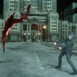
Ardyn's scythe mod
Luna in wedding dress


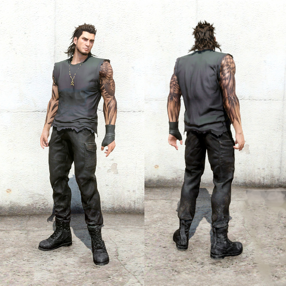
badass casual costumes for Gladio
I like the idea about adding the episodes to the main game. I absolutely hate them being in the main menu.
Ep Ignis would be problematic tho
edit:
Ardyn's scythe mod
Luna in wedding dress
badass casual costumes for Gladio
Last edited:
Hi guys, was this place in Episode Ignis (ending video maybe) or is something new?
Edit:
And what about this? lol this is only in the Royal Edition..
dunno about that room in altissia, its definitely more detailed than you would expect... probably discarded.
really interesting stuff and i hope with the level editor modders can do something with those empty spaces
I had someone ask me once what order to play the Episodes during a playthrough. I think E.Ignis could be implemented during Chapter 14 anytime before the Ifrit fight. For the Royal Edition I would say after Cerberus.
Likes:
Vankwisha
i dont like the idea of Ep ignis being implemented on the last chapter, i think it would harm the pacing and the entire "moment".
the other two not so much because Ep gladio could be implemented in the first half open world easily and since the second half is rushed with many "blank spaces" Ep prompto would be perfect to fill that void
the other two not so much because Ep gladio could be implemented in the first half open world easily and since the second half is rushed with many "blank spaces" Ep prompto would be perfect to fill that void
Likes:
Lord_Ham_Mork and Vankwisha
i dont like the idea of Ep ignis being implemented on the last chapter, i think it would harm the pacing and the entire "moment".
the other two not so much because Ep gladio could be implemented in the first half open world easily and since the second half is rushed with many "blank spaces" Ep prompto would be perfect to fill that void
the other two not so much because Ep gladio could be implemented in the first half open world easily and since the second half is rushed with many "blank spaces" Ep prompto would be perfect to fill that void